
Contemporary Korean Ink
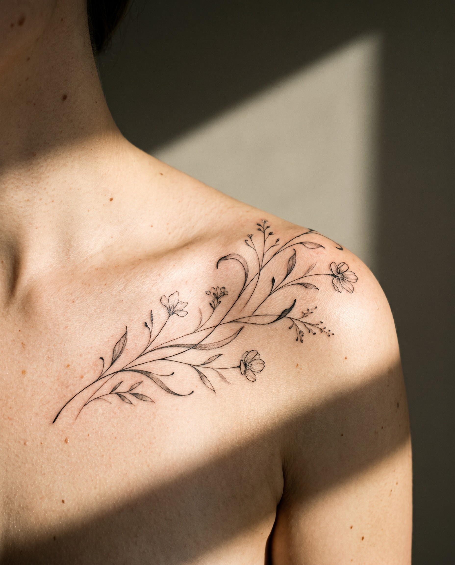
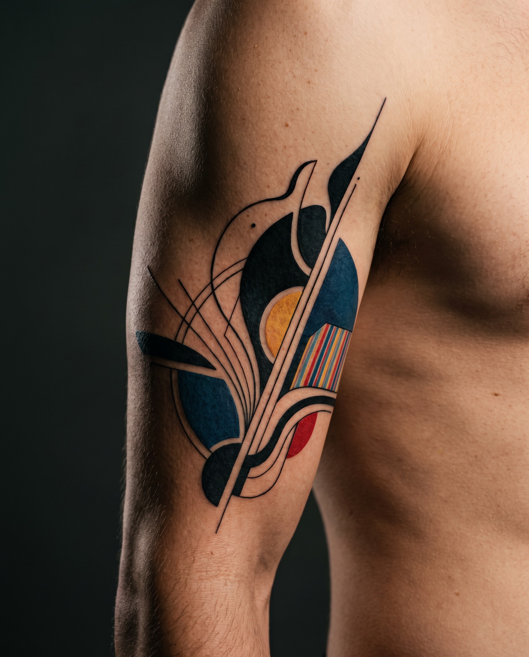
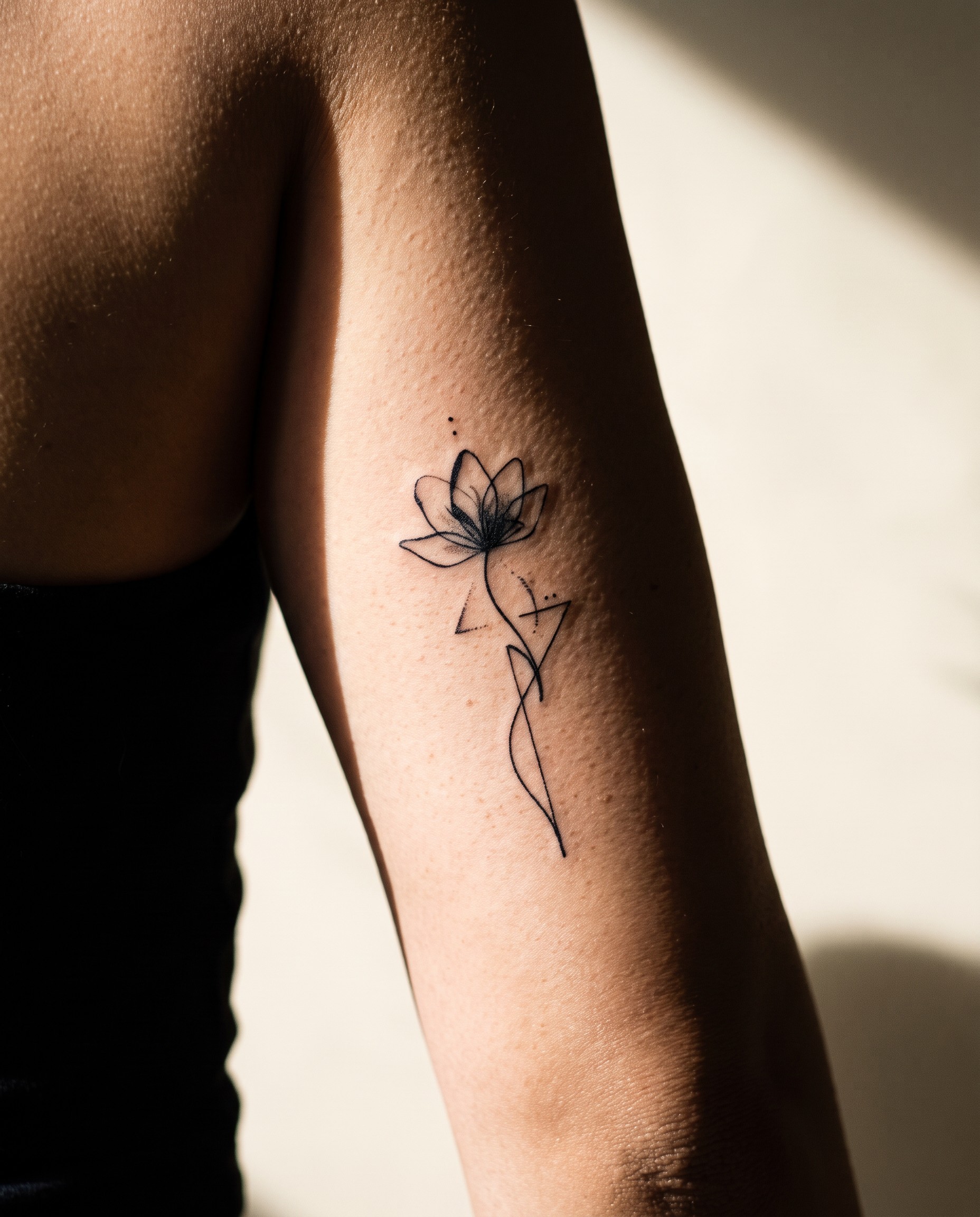
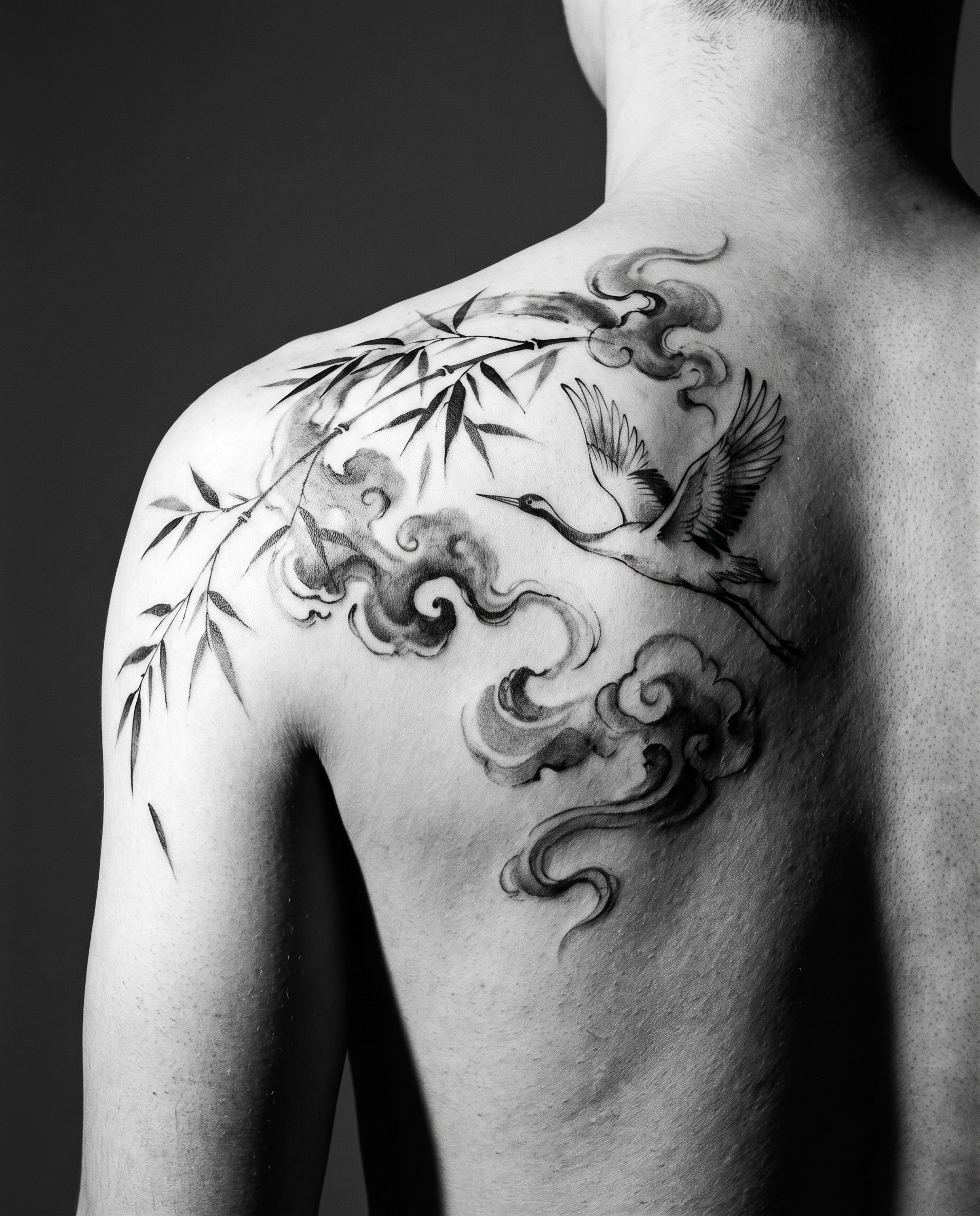
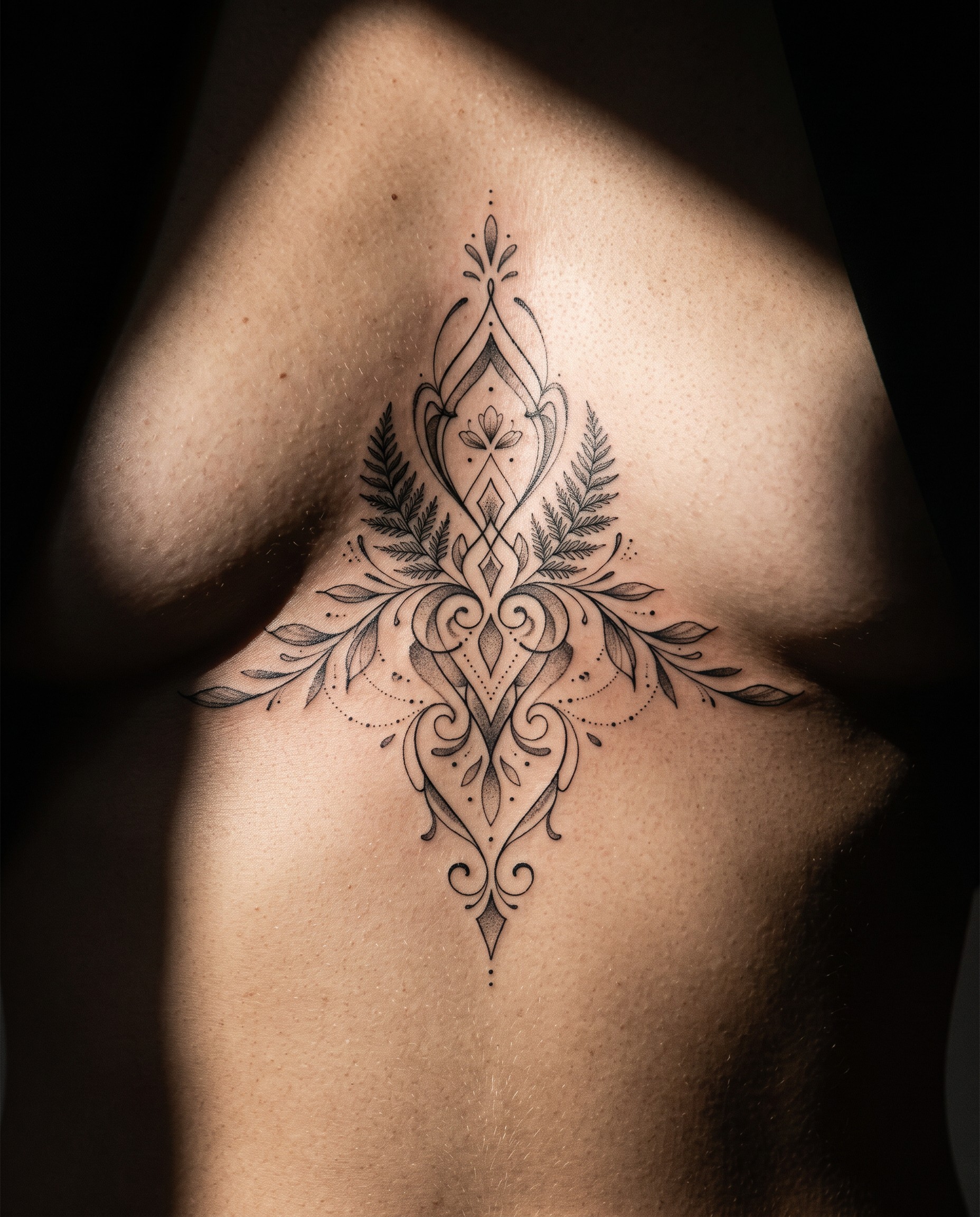
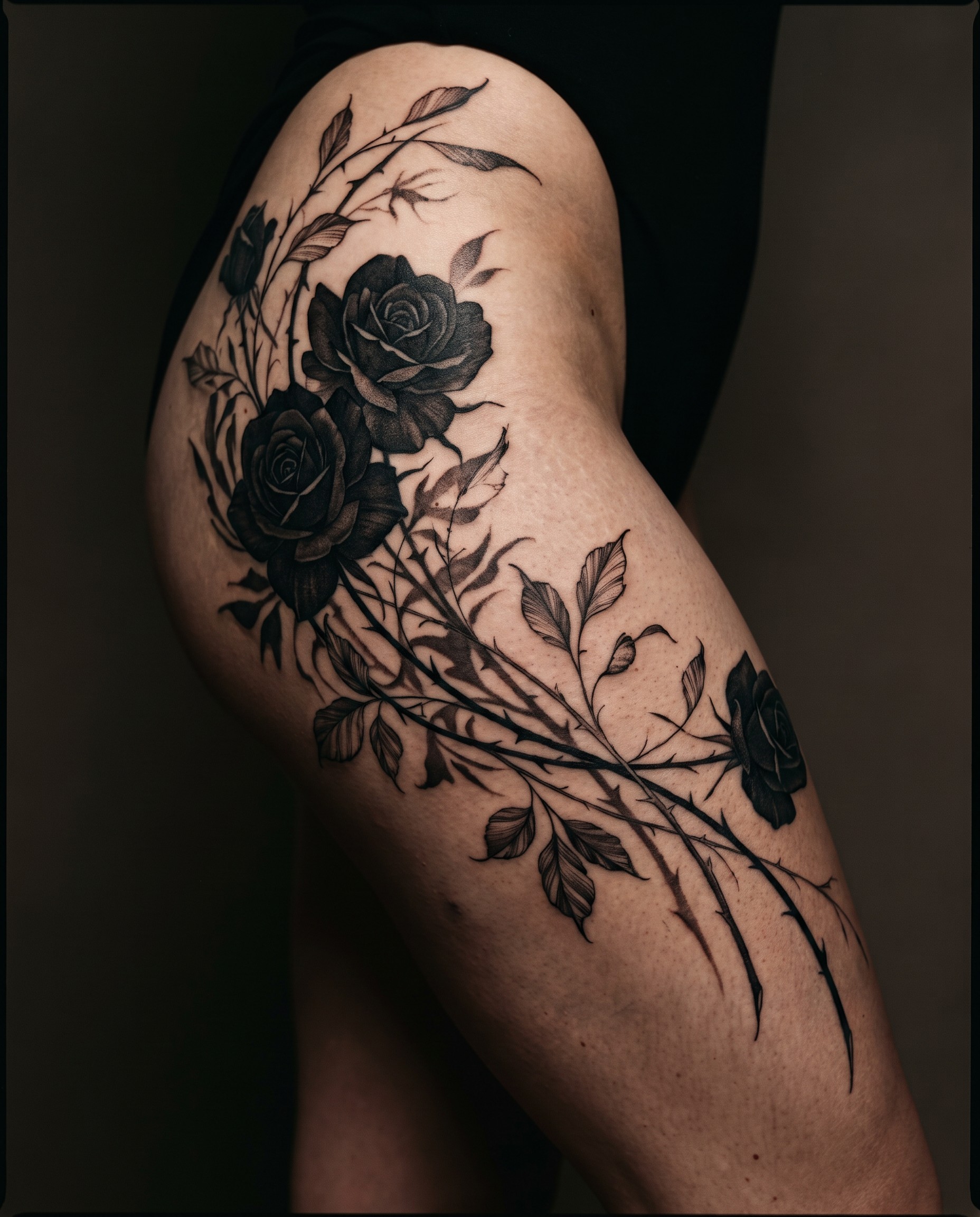
Style reference illustrations for consultation. Not tattoos by Sumi. / 상담용 스타일 참고 이미지이며 Sumi의 실제 작업물이 아닙니다.
Browse Sumi’s work and find the direction you want. Every piece here was tattooed by Sumi. Save the ones you like and bring them to your consultation — references help more than words.
Sumi의 실제 작업을 보시고 원하는 방향을 찾아보세요. 여기 있는 모든 작품은 Sumi가 직접 작업한 것입니다. 마음에 드는 것을 저장해 상담 때 보여주시면 됩니다 — 말보다 참고 이미지가 훨씬 정확합니다.
About the images on this page / 이 페이지의 이미지에 대해
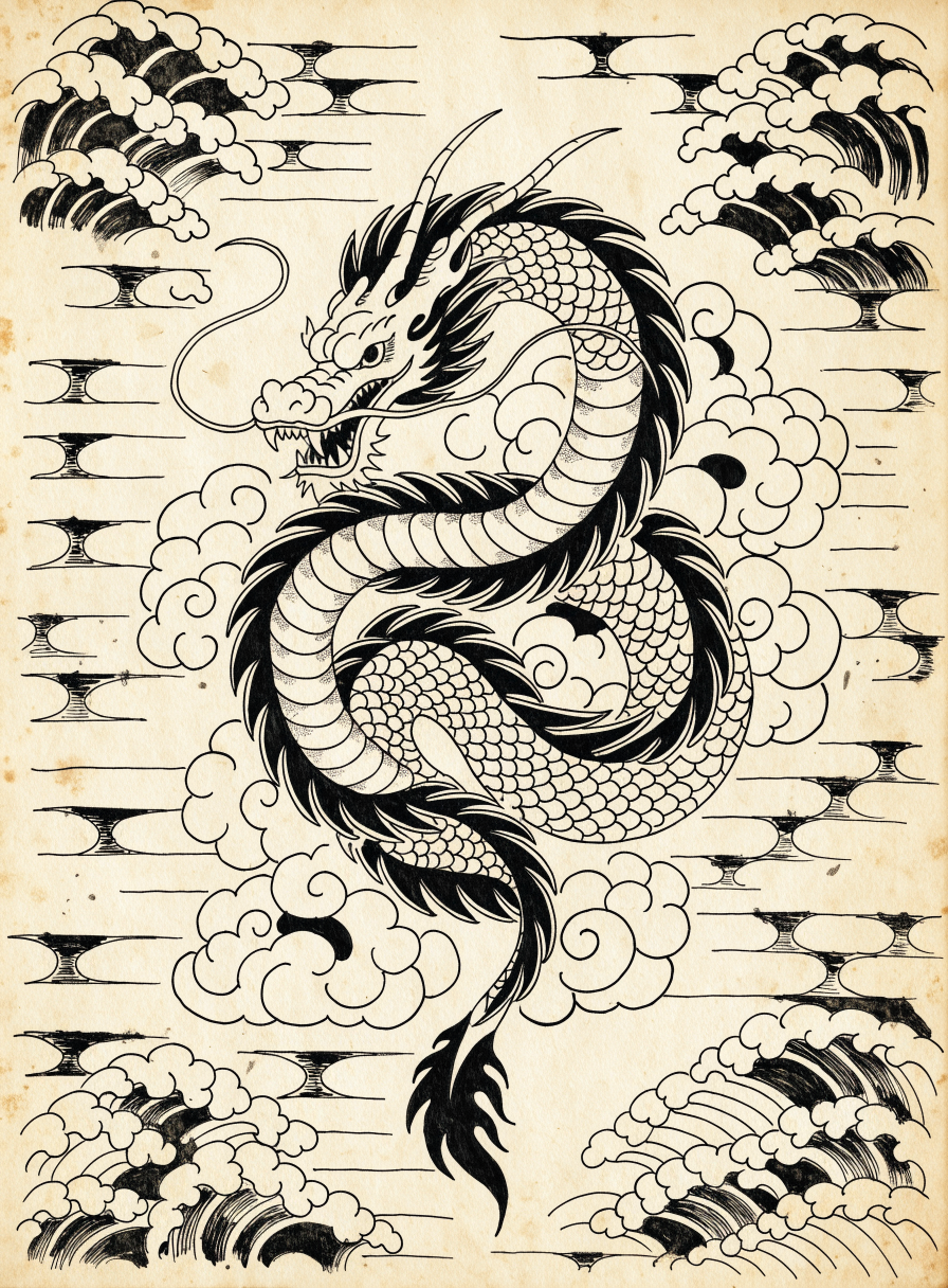
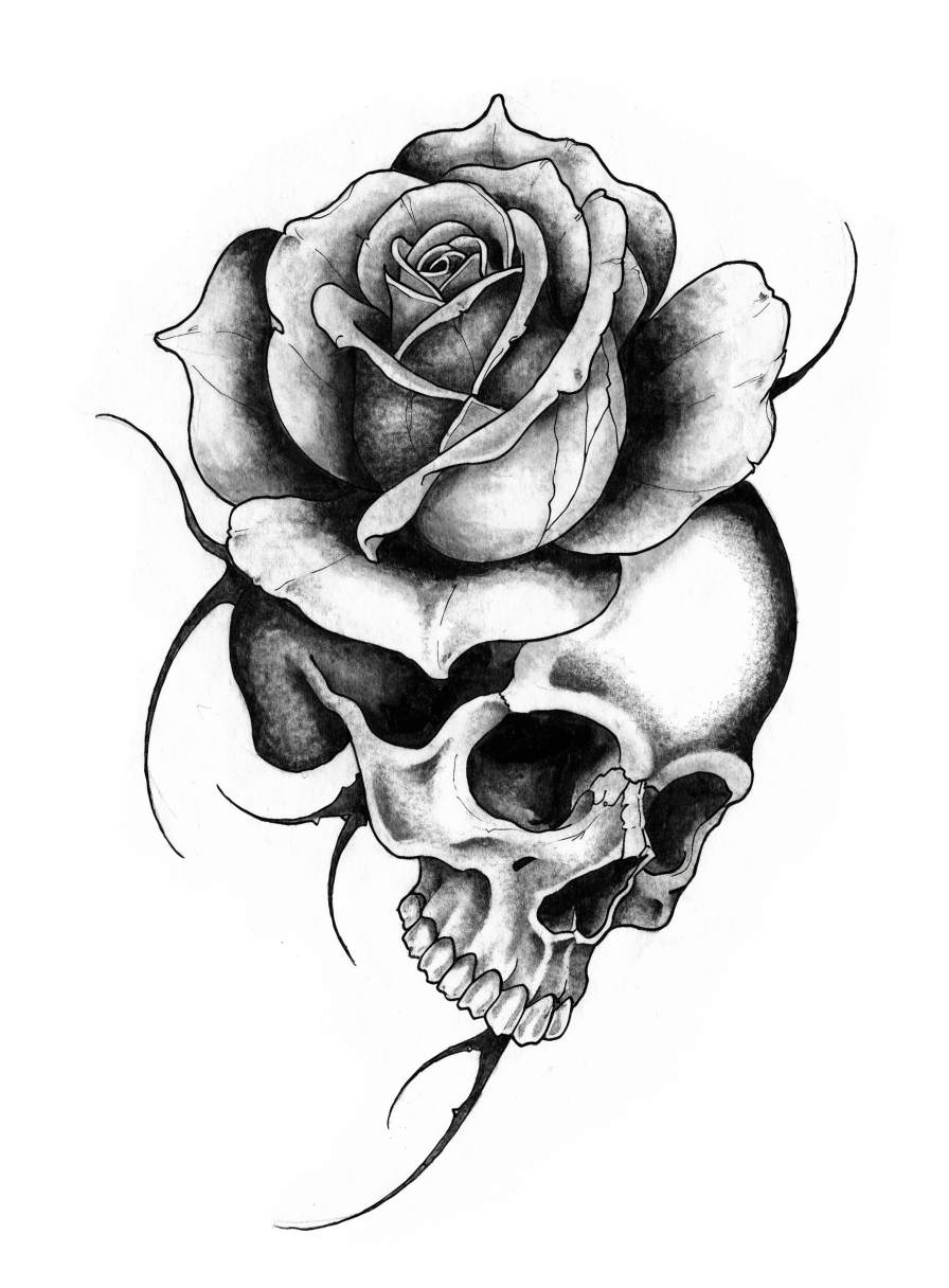
Style reference illustrations below each heading show what each style looks like — they are illustrations, not tattoos by Sumi. The Latest work section at the bottom is Sumi’s real work, pulled live from Instagram.
각 스타일 아래의 참고 일러스트는 스타일이 어떤 느낌인지 보여주는 이미지이며 Sumi의 실제 작업물이 아닙니다. 하단 Latest work 섹션이 인스타그램에서 실시간으로 불러오는 Sumi의 실제 작업입니다.
Japanese Irezumi / 일본 이레즈미
Bold outlines, structured shading, and background elements like wind, water, and clouds that tie the whole composition together. Classic subjects include dragons, koi, tigers, and phoenixes. Designed to read as one flowing piece across the body, so it is usually planned large and over multiple sessions.
굵은 외곽선, 구조화된 음영, 그리고 바람·물·구름 같은 배경 요소로 전체 구도를 묶어냅니다. 용, 잉어, 호랑이, 봉황이 대표적입니다. 몸 전체에 하나의 흐름으로 읽히도록 설계되어, 보통 여러 세션에 걸친 대형 작업으로 계획합니다.
Black & Grey / 블랙 앤 그레이
Diluted black ink builds gradients and depth without color. Suits realism, portraits, and fine detail, and it ages more predictably than color because there is no pigment shift to worry about.
검정 잉크를 희석해 색 없이 계조와 깊이를 만듭니다. 사실주의, 인물화, 섬세한 디테일에 적합하며, 색소 변화가 없어 컬러보다 시간이 지나도 예측 가능하게 유지됩니다.
Color / 컬러
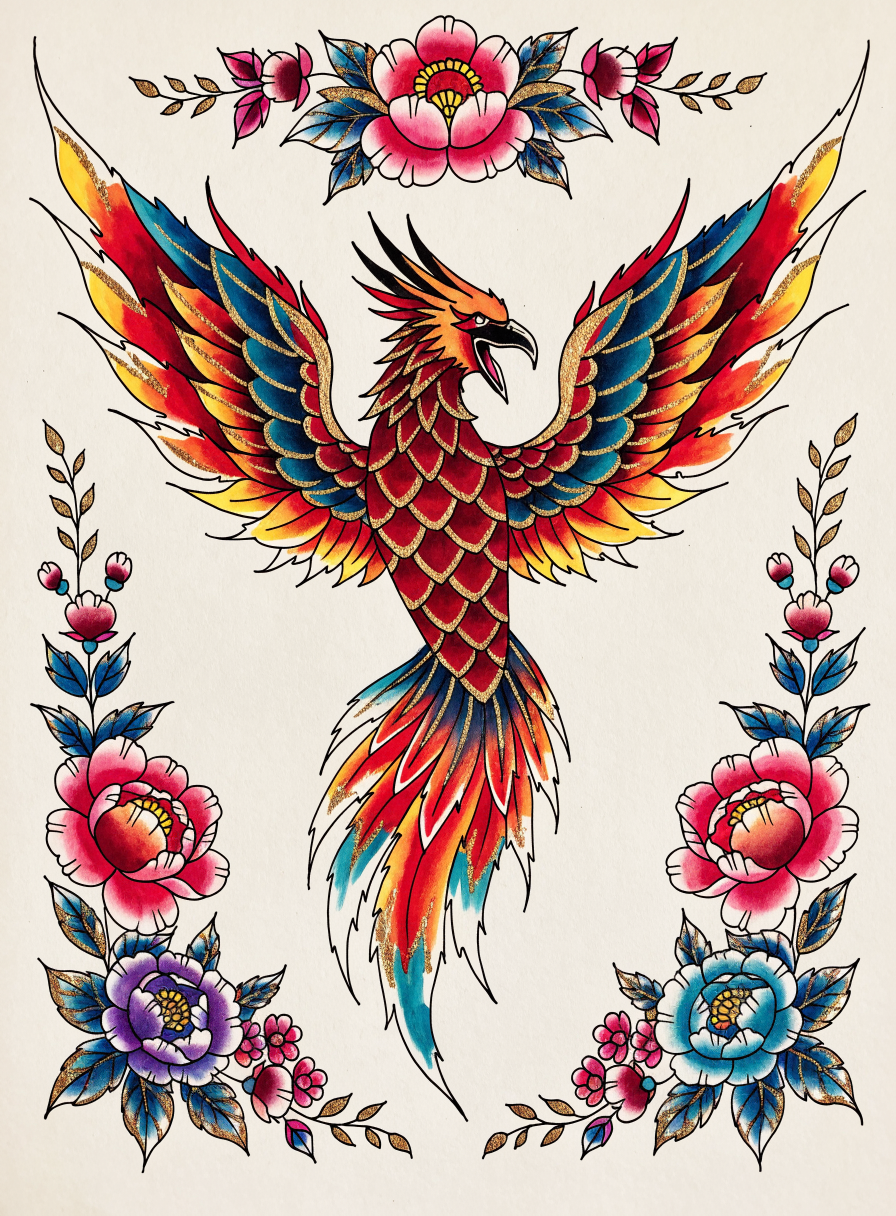
Full-color work, from soft watercolor blends to saturated traditional palettes. Color takes longer to apply and needs more diligent sun protection afterward, but nothing else reads the same way from across a room.
부드러운 수채 느낌부터 진한 전통 색감까지 폭이 넓습니다. 작업 시간이 더 걸리고 이후 자외선 관리가 중요하지만, 멀리서도 눈에 들어오는 힘은 컬러가 가장 큽니다.
Line work / 라인워크
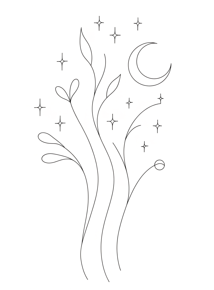
Clean, consistent lines with little or no shading. Reads well at smaller sizes and is a common choice for a first tattoo. There is nothing to hide behind, so line quality is entirely down to the artist’s hand.
음영을 거의 쓰지 않고 깔끔하고 일정한 선으로 완성합니다. 작은 크기에서도 잘 읽혀 첫 타투로 많이 선택됩니다. 숨길 것이 없는 기법이라 선의 완성도가 곧 작가의 실력입니다.
Lettering / 레터링
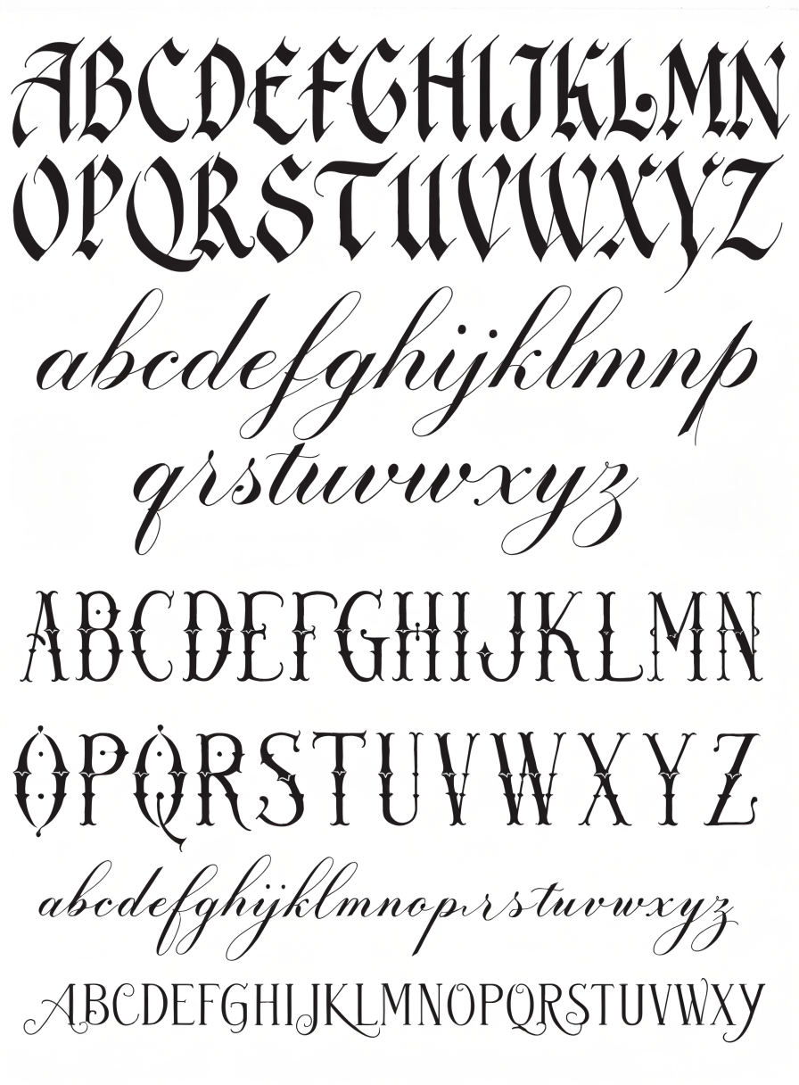
Names, dates, and phrases in scripts ranging from fine cursive to bold blackletter. Spacing, size, and placement matter more than people expect — text that is too small or too thin will blur as it ages, so sizing is chosen with the next twenty years in mind.
이름, 날짜, 문구를 가는 필기체부터 굵은 블랙레터까지 다양한 서체로 새깁니다. 자간·크기·위치가 생각보다 훨씬 중요합니다. 너무 작거나 얇은 글씨는 시간이 지나며 번지기 때문에, 20년 뒤를 기준으로 크기를 정합니다.
Latest work / 최신 작업
Updated automatically from Sumi’s Instagram. / Sumi의 인스타그램에서 자동으로 갱신됩니다.


Ready to talk about yours? / 상담 문의
Send your idea, the placement on your body, rough size, and any references you saved. Call 213-915-2009, use the contact form, or DM @sumitattoo__.
원하시는 도안, 부위, 대략적인 크기, 저장해두신 참고 이미지를 보내주세요. 전화 213-915-2009 · 문의 폼 · 인스타그램 DM
 English
  Korean